 I don't consider myself an architectural critic. I have not immersed myself in the history of buildings and starchitect personalities in order to form academic opinions. Rather, I start with the place where I live (or visit) and think about what I see and how I feel about it.
It's important to me to be informed and accurate and respectful of the efforts of architects and patrons alike, but at the end of the day, it's my skyline, my neighborhood, my vista, too. I feel from that standing alone, I have a right to comment on what's built around me, regardless of how much Vincent Scully I've read.
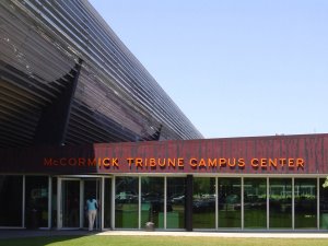
So, it wasn't until this past August that I got to the Illinois Institute of Technology to see Rem Koolhaas's campus center that was completed in 2003. While I'm working on an essay about the the building's overall merits to be published elsewhere, one aspect of Koolhaas's work really bothered me. Yet, I've found no other writer or critic who has mentioned it.
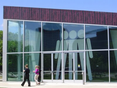
In the austere, universal graphics Koolhaas uses throughout the center, he has eliminated women. Everywhere, he's planted the universal male graphic, yet females are not represented.

 For a man who holds himself up as a hyper-aware globetrotter (in one of his books, he logs the staggering number of nights he's spent in hotels and the number of miles he's flown), Koolhaas doesn't seem too bothered with reflecting that insight in the information-conveying details of his work.
This interior should have been universally lampooned by IIT's female faculty and student body.It's an embarrassment to the university and its female students as far as I'm concerned.
And before you suppose that I'm jumping to conclusions, that Koolhaas has used this male symbol to convey a universal sense of "mankind" and that I'm just hypersensitive, take a look at this:


The bathroom plaques reveal the truth about who is represented in Koolhaas's graphics. Women get when we're not really included. This space depicts for us in relatively clear terms that we're not expected to belong there or thought of as belonging there. And, it's the student commons of a major university.
Why did all the critical eyes on this project allow this to pass unnoticed and unaddressed?
Update: I am grateful to a commenter for pointing out who designed the interior of this building and recommending I contact them. I will after Thanksgiving.
I believe this issue is a bit like how our consciousness has been raised in the way we write. We no longer use the pronoun “he” to represent men and women. We change the subject to a plural so we can write “their.” Or we interchange “he” and “she” to show our awareness of both genders. Surely an organization as creative as OMA and their design team could have come up with a way of creatively addressing (or rendering moot) issues of gender. There are details in buildings that convey information that can be read. This building, I still argue, got those details wrong. But, I’m looking forward to learning more.
Thank you to my commenter and to all of you who stopped by. May you find much on your plates this week for which you are thankful.
3 comments:
It might be worth approaching 2x4, the studio that did the graphics for the student cetner, with your question. Considering two of the three founding partners are women, I wonder if it was never an issue. I'm guessing they'll say the symbol is androgynous, but at the bathrooms they couldn't do that, hence the discrepancy.
Here's a discussion with Michael Rock of 2x4. I haven't listened to it yet, but thought it might be of interest.
Thanks, I'll take a listen. Also, yesterday, spoke with Hunter at 2 x 4 who said to e-mail the query to him, which I did. We'll see if I get a response.
Post a Comment