Sunday, November 27, 2005

Back Issues: Paste


I had some catching up to do, so I took a stack of magazines with me over T-giving weekend. While WXRT's Lin Brehmer does a heckuva lot to keep Steve Goodman's memory alive in Chicago, it was still a treat to see the Georgia-based Paste Magazine dedicate an entire back page (in the June/July issue) to the musician who called this town home:

(Steve) Goodman, a terrific singer and even better songwriter who lived for the Chicago Cubs and died far too young, still might one day receive the critical and popular acclaim he deserves. You never know. . . .

Throughout his career Steve Goodman confounded listeners and critics by tossing musical changeups and curveballs into the mix. Pegged as a sensitive singer/songwriter folkie, Goodman turned around and wrote hilarious parodies of country music (the David Allan Coe-popularized "You Never Even Call Me By My Name," which skewers every cliche ever lassoed to a two-step shuffle), covered jazz standards from the '30s, and enlisted stalwart bluegrass mandolin picker Jethro Burns to be his musical foil. Pegged as a serious, literary writer, he thumbed his nose at pretension by concisely summarizing the plot of Moby Dick as a twelve-bar blues. . . . And always he wrote about his beloved Chicago, firing broadsides at the notorious Lincoln Park Towing Company, simultaneously eulogizing and sending up longtime mayor Ricahrd Daley, echoing the prayers and doubts of millions of Cubs fans worldwide.


The article was written by Andy Whitman who blogs at Razing the Bar. You can find the full text posted there.

Wednesday, November 23, 2005

From Gourd Man to You on Thanksgiving

This one makes me happy. Can't help it. It's Gourd Man by Shen Cheng Xu and it's part of the Lincoln Park Contemporary Art Initiative. You can find it tucked away on the southeast corner of Dickens and Lincoln Park West.

Happy Thanksgiving. See you next week.

--jr

Monday, November 21, 2005

Rem Koolhaas, IIT, and the Absolute Absence of Women

I don't consider myself an architectural critic. I have not immersed myself in the history of buildings and starchitect personalities in order to form academic opinions. Rather, I start with the place where I live (or visit) and think about what I see and how I feel about it.

It's important to me to be informed and accurate and respectful of the efforts of architects and patrons alike, but at the end of the day, it's my skyline, my neighborhood, my vista, too. I feel from that standing alone, I have a right to comment on what's built around me, regardless of how much Vincent Scully I've read.

So, it wasn't until this past August that I got to the Illinois Institute of Technology to see Rem Koolhaas's campus center that was completed in 2003. While I'm working on an essay about the the building's overall merits to be published elsewhere, one aspect of Koolhaas's work really bothered me. Yet, I've found no other writer or critic who has mentioned it.

In the austere, universal graphics Koolhaas uses throughout the center, he has eliminated women. Everywhere, he's planted the universal male graphic, yet females are not represented.For a man who holds himself up as a hyper-aware globetrotter (in one of his books, he logs the staggering number of nights he's spent in hotels and the number of miles he's flown), Koolhaas doesn't seem too bothered with reflecting that insight in the information-conveying details of his work.

This interior should have been universally lampooned by IIT's female faculty and student body.It's an embarrassment to the university and its female students as far as I'm concerned.

And before you suppose that I'm jumping to conclusions, that Koolhaas has used this male symbol to convey a universal sense of "mankind" and that I'm just hypersensitive, take a look at this:


The bathroom plaques reveal the truth about who is represented in Koolhaas's graphics. Women get when we're not really included. This space depicts for us in relatively clear terms that we're not expected to belong there or thought of as belonging there. And, it's the student commons of a major university.

Why did all the critical eyes on this project allow this to pass unnoticed and unaddressed?

Update: I am grateful to a commenter for pointing out who designed the interior of this building and recommending I contact them. I will after Thanksgiving.

I believe this issue is a bit like how our consciousness has been raised in the way we write. We no longer use the pronoun “he” to represent men and women. We change the subject to a plural so we can write “their.” Or we interchange “he” and “she” to show our awareness of both genders. Surely an organization as creative as OMA and their design team could have come up with a way of creatively addressing (or rendering moot) issues of gender. There are details in buildings that convey information that can be read. This building, I still argue, got those details wrong. But, I’m looking forward to learning more.

Thank you to my commenter and to all of you who stopped by. May you find much on your plates this week for which you are thankful.

Sunday, November 20, 2005

Cupolas, Continued

Holy Trinity on Noble and Division awaits its new cupolas. See earlier post on Chicago Metroblogs here to chart progress.


Is it just me or do they look 20,000 Leagues under the Seaish?

Tuesday, November 15, 2005

Ten Years of Blue Bag Failure

"With the well-documented failure of the blue bag program, and with other cities embracing comprehensive recycling programs, if Chicago wants to keep its reputation as environmentally advanced, sooner or later we're we're going to have to do a lot better," said Vandercook.


Full story, via Community Media Workshop, here.

21st Century Landscape: Cell Phone Towers

At the turn of the last century the urban landscape featured smokestacks. We've got cell phone towers.

To be exact, according to this site, there are 117,562 cell phone towers in Chicago as of September 2005. And, once you've noticed one, you see them all.

It's like riding up the elevator with someone who's humming Yankee Doodle Dandy. You can't get the damn song out of your head three hours later. Nor can you get the cell phone towers out of your sight. They're everywhere. And, they're as ugly as Yankee Doodle Dandy is annoying.

An August 2005 Associated Press story quotes monthly payments for cell phone tower space rentals at $800 - $2000 and the number of cellphones in use nationwide at 190 million. That's a pretty easy-to-understand explanation of why these things proliferate regardless of the vistas they destroy. The market couldn't care less what they look like.


More thoughts and photos here on cell phone towers in our landscape by blogger Dan Bricklin.

Monday, November 14, 2005

Over the Hedge and into the Sprawl

A few weeks ago, I took my son to see the new Wallace & Gromit movie (it was okay, but it's no Wrong Trousers), and they showed a trailer for a new movie called Over the Hedge. It looks like it might be the kid film version of Suburban Nation meets Fast Food Nation.

Apparently, it's being written and produced by artists Mike Fry and T Lewis,who also write a sprawl-aware strip cartoon by the same name.

The movie is due out in May 2006 and the rough story line (as best I can tell) is that some suburban wild animals are horrified to see their environment under threat by developers. Then, they get a map of the developer's plan for their area and see that it has a proposed park -- their new home. While some animals are dismayed, one makes the best of it by showing them all the leftover food available for them in big "shiny" cans.

See the movie trailer here.

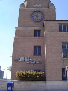
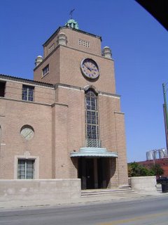
Memo to the Chicago Defender Staff: It's Philip B. Maher

Here are two shots of the retro-y building that houses The Chicago Defender at 2400 South Michigan. The venerable Defender newspaper has covered the African-American community since 1905.

According to the AIA Guide to Chicago, it was designed by Philip B. Maher to house the Illinois Automobile Club. The Defender moved in sometime in the 1950s. I'm presuming it was after they vacated their landmarked building at 3435 S. Indiana.

Last week, before I pulled out my AIA guide (duh), I called and spoke with the Defender's receptionist.

She said she didn't know who the architect was and transferred me to a line that went dead. I called back and said I was disconnected. She said that was probably because no one knew who the architect was.

"I don't think anybody here knows," she said. "We just work here."

Sunday, November 13, 2005

Welcome to Revitalization Magazine


Although I'm not pleased posts were down last week, I am pleased to tell you that it was because I was finishing up an assignment for the first issue of Revitalization Magazine, due to publish in January 2006. In a nutshell, it will focus on the business of "restoration." More to come in January, but, in the meantime, please read about this new publication at the link. I'm excited to be a part of it.

Friday, November 04, 2005

What's up with Chicago WhatKnot

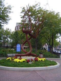
As long time listeners of this blog know, I've been tracking the Lincoln Park Community Art Initiative's annual public sculptural exhibit for a while. To the right are two shots that I took of the heavy-duty piece that's camped out for the year (and possibly longer, read on) at the northwest corner of the intersection of Halsted, Fullerton, & Lincoln called Chicago WhatKnot.

The shimmery disks are a lovely surprise when the sun hits them right, and I like that it has an underwatery feel. I also like how the weight and size of the sculpture contrast so sharply with floral life, like urban flora, yet it fits right in.

I'm especially pleased and honored that the artist, Chicagoan Nicole Beck, was kind enough to share some thoughts about the piece via e-mail. Be sure to visit her website if for no other reason than to see her personal photo on the contact page. It's quite possibly the coolest shot ever of an artist.

Nicole Beck on her sculpture, Chicago WhatKnot:

Chicago What Knot is 8' diameter x 20' steel and custom-cast glass rondeles. I built the piece entirely by myself, except for the steel tube rolling which was done at Chicago Rolled Metal (the same company the rolled the stainless tube arcs that traverse the lawn of Gehry's band shell lawn structure in Millenium Park.)

But as you can see by investigating the piece up close, I had to make some pretty specific miter cuts to reposition the graceful line that the tubing makes, and especially to fit the site (the tubing could not be rolled any tighter because it was at the limits of the equipment.)

The Alderman Vi Daley and her committee knew during judging for this year's show that they wanted the sculpture on this site, so I built the sculpture to be "site specific," to fit the dimensions and the scale of the site nicely.
The sculpture was created in response to the Art in the Gardens Project . . . that I did last summer in Grant Park on Michigan Ave. @ Balbo across from the Hilton. I had created a 40'x 100' living sculpture with plants as my medium.

Most of the gardens in this city-wide public art project were created to be looked at, but my project Snake Gourd Chamber Maze was designed to have a Celtic knot looped garden path that the viewer could walk through to experience the full beauty of the garden. . . .

Chicago WhatKnot was a response to Snake Gourd Chamber Maze in STEEL & GLASS! . . . For Chicago WhatKnot, the tendrils at top were created separately and bolted into place for ease of shipping and then the cast glass is installed on site into customized gaskets that also bolt into place.

I think of the cast glass discs as water droplets randomly interspersed throughout the tendrils sprays OR as stars in the sky seen through the bare tree limbs of winter.

This sculpture was a departure for me in that the lines are playful and lyrical and dance in space (alot of my other pieces are hard-edged and geometrical) see my web site.

There is talk of wanting to keep this piece permanent for the neighborhood, or perhaps rebuilding the piece in stainless steel (but will cost much more for this, as stainless is a VERY expensive material these days.)

But, I hope that the funds are collected as I personally believe that this piece belongs at this site and is no wonder, since it was specially designed specifically for this place.

I especially appreciate the night lighting with spots on the sculpture that make the discs glow and sparkle.

Thursday, November 03, 2005

The Children in the Box

I almost choked when I came across this last weekend while walking Boomer through the Ogden Park mall near Hudson and Sedgwick.

Do ya think they could have thought about the weather implications before they chose a precious fountain that needed to be wrapped up all winter? What is the point of putting a fountain in a park if you have to look at this ugly box six months out of the year? Whose bright idea was this?

Obviously, a fountain can't run during the winter, but it can still look nice. No fountain at all would be nicer than this box half of the year.

The other thing that really gets me is that I hate this fountain. It's a little boy and girl depicted at scale. Each holds a saucer. She has birds on her shoulder and he has frogs in his pocket. God, it's enough to give me cavities just thinking about it.

But, what I double hate about it is that the two little kids are white. (Well, technically, I think they're bronze.) But, they're depictions of what white kids look like. Don't get me wrong. I have nothing against white kids. I have two of my own.

But, my point is that this is a public place and when you depict people, especially with public art, you've got to think about the implications of how others, not in the depiction, might feel about seeing that in what is also their public space.

What does this sculpture imply to children of color about whom the park is for? Particularly given the fact that it's located in a predominantly white neighborhood? If it was a statue of civic pride -- like a tribute to the two youngest botanists ever, okay, maybe I get it. But, thinking about things from several vantage points shouldn't be that rare when shaping our civic spaces.

And, now that you got me thinking about it, it's creepy. Two children frozen in a green box all winter long. That's so screwed up.