This discussion at New (Sub)Urbanist and in the print version of the Chicago Reader is an important one. I'd like to agree with the comment that the commercial photography prohibition in Millennium Park won't last, but I'm not so sure.
I think a related issue is the diminishing numbers of public and commercially-owned places that refuse to allow flyers to be posted on their premises. Got a rock band? A fundraising event? The number of public and public-like spaces where you can distribute your information is limited.
Libraries have bulletin boards for this information, but their size and location vary among branches. Many shopping malls don't allow leaflets from the public. Starbucks prohibits any materials from being left in its stores. Barnes & Noble used to allow flyers in their lobbies, but no longer. Same with Borders.
Last year, I tried to post flyers for a non-profit event at a Starbucks. I was told "no." I wanted to drop off copies of an independent newspaper at Borders. They said "no." Both times, the employees felt really bad about turning me away. Their common sense and presence in the community told them this was no biggie. But, corporate policy overrode them. Would corporations benefit if they began thinking of customers as their stores' neighbors rather than as consumers?
I understand that the Millennium Park issue is a true tax-supported public space and not a commercially-owned space like I'm (mainly) complaining about. For this, I think the copyright issue is especially egregious. But, more and more often, commercial spaces function like public spaces. And, by looking at the flyer issue we can see in a subtle way how locally-owned coffee shops and bookstores function differently in our neighborhoods.
Because I don't have any independent bookstores or coffee shops in my neighborhood, I ended up posting my flyer and distributing my newspaper at my local YMCA (a non-profit organization.) They have a giant bulletin board in the women's locker room for flyers, and they provide a space for independent newspapers. Could their attitude have anything to do with their mission statement: "We build strong kids, strong families, strong communities"?
Friday, February 04, 2005

From the File Marked "Unfortunate Buildings"

This building on Division, just east of Milwaukee, is a) ugly and b) completely inappropriate in scale given the smaller buildings surrounding it. They've begun repairing the concrete and painting the east side of it, but it's not helping much. The two good things are 1) the people living in the building's south side will get a lot of sun and 2) it took me a while to notice it.

Thursday, February 03, 2005
"Tundra" Around the Corner
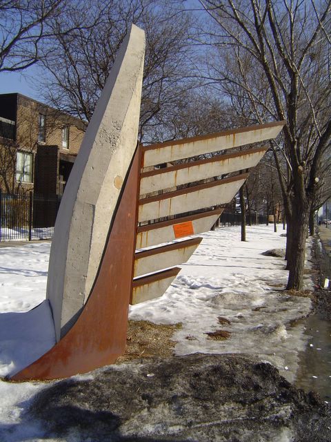
"Tundra," View 1
This sculpture is titled “Tundra.” It sits on the northeast corner of North Avenue and Orchard Street. I drive by it every day. At first I thought it looked like a giant, ugly iron with a rusty tail fin. Eventually, I sort of began to appreciate the contrast between its seeming aerodynamics and its sense of great weight. Then, one day I was walking my dog and I saw it from this angle:
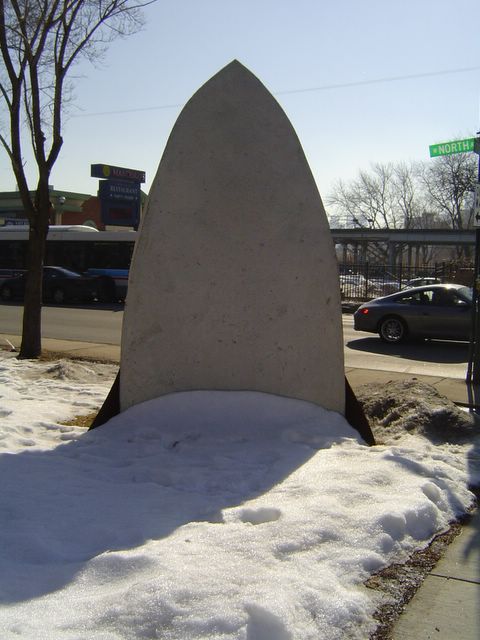
"Tundra," View 2
From here, it felt like the iron could flatten me at any moment, but I didn’t care so much because I was having fun enjoying its sharkness.
The piece, by Pat McDonald, was a winner in the 3rd annual Lincoln Park Sculpture Competition. Launched by my alderman Vi Daley and the Lincoln Park Community Art Initiative, the competition selects ten artists every year to display their work in our neighborhood.
Even if the sculptures aren’t always successful, they beat back the monotony, surprise the eye, and engage us in new ways as we mush along sidewalks or brake through traffic. Plus, just when we might be getting tired of them, ten new ones show up. Our next round of public art is expected in May.
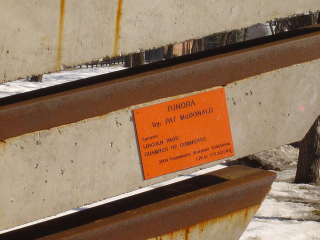
"Tundra," View 3
Side note: I used to think the giant orange rectangle on the fin was a lost dog flyer that someone hastily posted on the sculpture. But, upon closer inspection, it’s the artist’s name and title of work plaque! From afar, it looks like mild vandalism. It immediately draws the eye and distracts fromthe piece. What was the art committee thinking by pasting it to the middle of the sculpture?
Wednesday, February 02, 2005
Sidewalk Talk
Sometimes listening to Gretchen Helfrich's Odyssey makes my eyes glaze over, but yesterday she aired a particularly interesting conversation about the The State of Architecture in America. Her guests were Sarah Goldhagen of Harvard's Design School and Joan Ockman of Columbia University. They suggested that only 5% of our environment was built using an architect. If true, that explains a lot. . . Also, check out Discursive Recursions for a nice discussion about the tensions between zoning regulations and human rights ordinances in Urbana.
Tuesday, February 01, 2005
CPL Fires up Free Hot Spots
If you've ever stopped by a Starbucks on a Wednesday night, you know the desire for alternative places to think and work percolates within us. The Chicago Public Library expanded those significantly (albeit without the java), when, late last year, it began offering free wireless access at all 79 branches.
Free wireless access might seem to you like a modest city improvement, but it matters. As you can tell from the folks hanging out at your local Starbucks, we need more places not fewer where we can fill our minds or empty them out. Libraries have long been the traditional spaces to do that, and now they're ramped up and ready to go for the 21st Century. The funny thing is we'll probably end up checking out more books.
Free wireless access might seem to you like a modest city improvement, but it matters. As you can tell from the folks hanging out at your local Starbucks, we need more places not fewer where we can fill our minds or empty them out. Libraries have long been the traditional spaces to do that, and now they're ramped up and ready to go for the 21st Century. The funny thing is we'll probably end up checking out more books.
Saturday, January 29, 2005
Hey ladies, BOW!

Okay, one more discovery to share with you from my poking around the State of Illinois website. Then, I've got to do laundry and pay bills.
Ladies! You can Become an Outdoors-Woman thanks to the Illinois Deparment of Natural Resources and a non-profit group, BOW.
The Become a City Woman program (BOCW), with skills like how to get your table moved deeper into the non-smoking section, who's your alderman, and where to buy a good donut, has yet to be developed.
A Deeper Shade of Blue, Part Two

First Illinois committed to protecting gay people from discrimination. Now, they've made it illegal for health insurance companies to charge women for birth control pills. God, I love this state.
Whadda you say we wait seven days, and if we aren't all mingling in hell by then, the right wingers call it a day?
Update: I had this wrong. Insurance companies must cover the pills, but they may charge something for them. At least I had the seven days part right. Be gone with you right wingers!
Friday, January 28, 2005
You'll Never be Stirred to Greatness Here
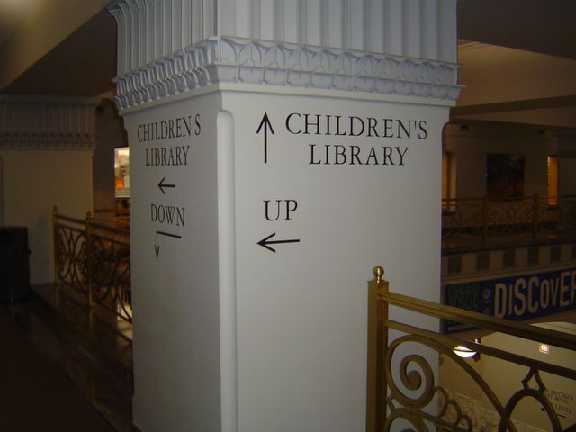
Yesterday I went to the Harold Washington Library for the first time in a long while and was reminded that the building is like a dunce's paper bag. You can't find your way out of it. Or, into it for that matter.
They shaped the main lobby like a giant cube. Four corridors depart off of it, but not one architectural detail suggests where the hallways lead. Left-over street banners and other paper afterthoughts sag from the walls. In the center of the lobby the architects created a circular opening in the floor that lets you gaze one whole storey below. The main level also houses the "Popular Library." I think this is where you'll find the Danielle Steel novels and the cool high school kids, but I may be wrong about that. Perhaps it's where they put the Starbucks.
The architects hid the unpopular library two escalators up, around a few corners, and through an undistinguished entry-way. Signs with giant letters and arrows shout from the gray walls. They seem to trying to make up for the work the architecture failed to do. Their bland tyepface drains the warmth from the atmosphere that the wood paneling and retro-lamps struggle to provide.
The architects tried to breathe some life into the place by stencilling quotations from Big Thinkers on the walls, but they failed miserably. You'll never be stirred to greatness here. You'll never feel inspired to invent a flying machine or pen a novel based on Proust's Remembrance of Things Past. Frankly, you'd be lucky to find the books you want.
The library makes almost no effort to help patrons figure out what floors house which books. When I told a reference librarian that I was having a hard time finding the call number locations for the titles I needed, she laughed and said, "Tell me about it. We should really have those posted somewhere." Then she reached for a thin black binder where she kept the secret information. My six books were located on four different floors.
Even the library's website takes pains to distance itself from the creation:
The architect responsible for the design is Thomas H. Beeby and his colleagues in the firm Hammond, Beeby and Babka. It was their design as a part of the Sebus Group that won a design/build competition in June of 1988.
In other words, we're not responsible. We love libraries. Beeby's the one who hates them.
Thursday, January 27, 2005
When You're With a Sweep . . .
I had my chimney swept today by a skinny man with a smile like Dick Van Dyke's. His cheeks were covered with gray soot. I think he might have rubbed it on right before he rang my doorbell. He came right in and set to work. He spread a sheet in front of my fireplace and removed the screen as if it were a rare painting. He cleaned out the ashes with an industrial vacuum and then opened his tool box full of brushes. One brush looked like the wooden type you might buy to scrape snow off your car. Another broke into three parts and had bristles that looked like a spikey Cher haircut. It disappeared up the chimney one inch at a time. At the bottom of the tool box was an improbably gold shovel. It flashed at me from the nineteenth century, caught me marveling at its owner. Then, as quickly as he arrived, my sweep left. He folded up his tools, tipped his hat, and disappeared over the roof tops of Old Town. I completely forgot to shake his hand.
Flyers on Your Windshield
Nordic Skiing at Camp Sagawau in Cook County. . . HotHouse February Calendar of Latin and African Dance, Jazz, Blues and Improvised Music . . .Free Green Tech U courtesy of Richard M. Daley. . ."Really new music spiked with jazz, rock, folk and a dash of zen" from Fulcrum Point
Wednesday, January 26, 2005
Then & Now: 1327 N. Noble

Balloon man and boys in front of St. Stanislaus Kostka Church. 1911.

Van in front of St. Stanislaus Kostka Church, 2005.
Sunday, January 23, 2005
Chicago's Finest (No Irony Intended)
"Many men of the Sikh faith wear a small sword under their clothing. Orthodox Jews often refuse to move illegally parked cars on Saturdays. Outsiders may photograph statues in Buddhist temples, but not in Hindu ones.
These are some of the insights in a series of videos the Chicago Police Department uses to train its officers in dealing with non-Christians. Community leaders say the videos have substantially improved relations between various religious groups and police officers.
'This is not just a superficial thing,' said Kareem M. Irfan, chairman of the Council of Islamic Organizations of Greater Chicago. 'It has changed our community's relationship with the police to the extent that people are beginning to see the Chicago Police Department as an ally rather than an opposing force.'"
From The New York Times, January 23, 2005
Keep DREAMING BIG!!!
And now for a word from Michelle La Groue, Miss Illinois 2004

http://www.missil.org/files/ILAUTOPADS.jpg
Happy New year to everyone! I hope that 2005 is a year full of realized dreams and lots of success for all of you. December was not very busy for me as Miss Illinois, but still a fulfilling month between visiting friends and spending time with family for the holidays. . .
I was honored to be the emcee for an Essay, Poetry and Art contest awards event at Jones High School in Chicago on December 16. . . . I am very excited as these students give tangible evidence of the violence that the Miss Illinois Organization is taking a stand against.
On a lighter note, the weekend of December 10-12 was a small Miss America Reunion in Nashville, TN. A few of us met in Nashville hosted by Ashley Eicher, Miss Tennessee, and had a blast together. Thanks, Ashley! It was our first time to see each other after the Miss America competition in Atlantic City and so fun to hang out without any pressure of competition.
Thank you for your continued support.
Keep DREAMING BIG!!!!
E-mail me
at: missil04@yahoo.com
Love,
Michelle
http://www.missil.org/files/ILAUTOPADS.jpg
Saturday, January 22, 2005
A Deeper Shade of Blue
On the heels of the inauguration of a detestable President whose key supporters conveniently ignore that Christ wanted us to love our neighbors, I am proud that yesterday our state prohibited discrimination based on sexual orientation. Nothing threatens my marriage, my family, or my children's well-being more than the support of bigotry. I am happy and grateful to live here.
Governor's press release
Governor's press release
Friday, January 21, 2005
Not Made in Chicago
The clothes I put on this morning and where they came from:
- Blue wool sweater. Made in Hong Kong. Bought at Saks Fifth Avenue (on clearance).
- Gray v-neck cotton t-shirt. Label missing. Origin unknown.
- White bra. Made in Indonesia. Bought at Target. (It pains me to tell you that.)
- Rust corduroy pants. Made in Cambodia. Bought at Old Navy.
- Underwear. Made in Israel. Bought at Victoria's Secret.
- Blue cotton socks. Origin unknown.
- Brown snow boots. Made in China. Bought from Lands' End.
Thursday, January 20, 2005
Splitting Food Hairs with Ira Glass, Continued
You'll never guess who stopped by my humble, cobbled blog the other day. Mr. Ira Glass.
If you look around, you'll know I'm in no way ready for a visit from the big-time likes of him. I've got draperies to hang, boxes to unpack, and I can't decide what color to paint the rec room. Long ago I realized with my real house that if I waited until it was immaculately clean to have people over, I'd end up dying alone in an unmade bed. So be it with my blog. Come on in, Ira. It's my honor. The place is a mess, but go ahead and make yourself at home.
It seems Ira got word that I was niggling over some nuances of a review he wrote in the Reader (January 15 blog entry).
He dropped in to clarify:
At neighborhood restaurants, great food and great people blur. Choosing the best, I still think, is a bit like choosing a favorite relative. But, Ira deserves a break here. It was a 300-word restaurant review, not an urban studies thesis.
Coming Soon: Part 2 - Quibbling over the Importance of "New York"
If you look around, you'll know I'm in no way ready for a visit from the big-time likes of him. I've got draperies to hang, boxes to unpack, and I can't decide what color to paint the rec room. Long ago I realized with my real house that if I waited until it was immaculately clean to have people over, I'd end up dying alone in an unmade bed. So be it with my blog. Come on in, Ira. It's my honor. The place is a mess, but go ahead and make yourself at home.
It seems Ira got word that I was niggling over some nuances of a review he wrote in the Reader (January 15 blog entry).
He dropped in to clarify:
I meant "neighborhood restaurant" as something connoting a sense of size and scale. Reasonable prices. Everyday eating. Versus, say, a tourist restaurant or a fancy businessman's restaurant.I get this. To the list of neighborhood restaurant features, I'd add dedicated personnel who seem integral to the enjoyment of the place. I'm thinking here of the ubiquitous, gracious owner of Aladdin Falafel House on Lincoln Avenue. Or, the warm owner of Think who daydreamed about putting a nursery downstairs so parents could enjoy dinner while she cared for their kids. Or, the host of Club Lago who kissed his two fingers and waved them at us as we left -- "See youse!"
At neighborhood restaurants, great food and great people blur. Choosing the best, I still think, is a bit like choosing a favorite relative. But, Ira deserves a break here. It was a 300-word restaurant review, not an urban studies thesis.
Coming Soon: Part 2 - Quibbling over the Importance of "New York"
Tuesday, January 18, 2005
Saturday, January 15, 2005
Splitting Food Hairs with Ira Glass
The first place I go to look for restaurant options is the Reader. Their "R"-rated spots almost always satisfy, and they frequently identify places I might not have discovered otherwise. So when I read that Lula Cafe received a "RRR" featuring a superlative review by Ira Glass, local-boy-turned-NPR-legend, I headed over there. Yes, the place is truly notable. You must go.
But two things in his review struck me.
First, he writes: "I don't say this lightly: it may be the best neighborhood restaurant in Chicago."
I don't think you can say a neighborhood restaurant is the best in Chicago any more than you can say Pilsen is better than Andersonville. Maybe he means "best restaurant located in a neighborhood." But the adjective where he's placed it suggests to me that the restaurant is particularly representative of the neighborhood somehow. That's hard to find and do. And, I don't think that's what Lula Cafe is, as splendid as it is.
Second, he writes: "I brought a friend who's a professional chef in New York, and he stuck around for hours to order nearly everything on the menu. "
Why use the qualifier "in New York"? It has an unfortunate whiff of cultural one-upsmanship. I'd like to think his including it was a grammatical reflex rather than a hint of the spoils of fame.
For the record: a) I don't know Ira Glass; b) I really love and admire This American Life; c) I suspect everything tastes different on the radio.
Thursday, April 08, 2004
We've Gone Mothballs until there is Regime Change at Home
I am outraged that our President can not appear before the 9/11 panel under oath and on the record. It is shameful. Instead, he is meeting with the panel in secret and with Dick Cheney by his side. This fact alone suggests that the biggest threat to the future of our nation is George W. Bush.
I feel we must do everything we can to help oust this President and put a true statesmen in the White House. I feel it is absolutely urgent. We can not afford another four years of this reckless behavior.
All my blogging time will now go to VoterBoat. Please do what you can, too. Writing letters to editors is an urgent need and very easy to do on your own schedule.
Please visit me and write me at http://www.VoterBoat.blogspot.com where your submissions and participation are welcome.
See you next year. . .
I feel we must do everything we can to help oust this President and put a true statesmen in the White House. I feel it is absolutely urgent. We can not afford another four years of this reckless behavior.
All my blogging time will now go to VoterBoat. Please do what you can, too. Writing letters to editors is an urgent need and very easy to do on your own schedule.
Please visit me and write me at http://www.VoterBoat.blogspot.com where your submissions and participation are welcome.
See you next year. . .
Tuesday, April 06, 2004
"Over time our friend came to wear the smile on his face that you see today"
So, two nice things happened today. First, I received a nice e-mail from fellow Chicago blogger FirstCity. Go check him out. We're on the same wavelength, but his is much better. It's got photos. Thanks, FirstCity!
Second, earlier this year (Feb. 10), I blogged about the Alaska Airlines Eskimo logo. That same day I e-mailed the corporate p.r. office and asked about the history of the logo and if it was in fact an Eskimo. They responded today! And, their response is why I love non-fiction more than fiction. Life is so rich - you can't write this stuff - the Gay Nineties Look!?
"Sorry it took so long to respond to your request. The person who normally monitors this website left the company.
WHO IS THE FACE ON THE TAIL OF OUR AIRCRAFT?
The Eskimo on the tail of our aircraft is the result of an evolution of graphics dating back to the early seventies. At that time we were studying a new look for the airline that would reposition us from the highly promotional "Gay Nineties" look, which was very successful with tourists, to a more modern and businesslike airline that would appeal to the frequent business traveler.
We recognized we could not lose that aspect of the carrier that was uniquely "Alaskan." The difficulty of finding one image that suited the carrier and the state soon became apparent. Finally, four distinct images were chosen to represent the history and the regions of Alaska. The Eskimo for the Arctic and its people; the Russian spires for the early history of Alaska's development; the Totem for Southeast Alaska and its Native culture; and finally, the Sourdough for Alaska's gold rush days.
As the airline progressed, a further definition of our public imagery was studied. Lippcott and Margolis undertook a massive image awareness campaign and attitude survey that eventually led to the conclusion that four images were too many for any company to try to project, especially a small regional airline. The study concluded that a single image would have much greater success in positioning Alaska Airlines with the business traveler, and would have a much greater chance of retention.
Several designs were reviewed in the middle seventies to address this concern. Eventually the Eskimo was settled on as the most representative and uniquely Alaskan image, and one in which we had already established a franchise. The original Eskimo image portrayed a rather serious fellow, but over time our friend came to wear the smile on his face that you see today.
Today's look now represents the airline’s Alaskan heritage, including the spirit of its people, the blue of its skies and waters, the green of its forested land, and the white of its snow-capped mountains."
Second, earlier this year (Feb. 10), I blogged about the Alaska Airlines Eskimo logo. That same day I e-mailed the corporate p.r. office and asked about the history of the logo and if it was in fact an Eskimo. They responded today! And, their response is why I love non-fiction more than fiction. Life is so rich - you can't write this stuff - the Gay Nineties Look!?
"Sorry it took so long to respond to your request. The person who normally monitors this website left the company.
WHO IS THE FACE ON THE TAIL OF OUR AIRCRAFT?
The Eskimo on the tail of our aircraft is the result of an evolution of graphics dating back to the early seventies. At that time we were studying a new look for the airline that would reposition us from the highly promotional "Gay Nineties" look, which was very successful with tourists, to a more modern and businesslike airline that would appeal to the frequent business traveler.
We recognized we could not lose that aspect of the carrier that was uniquely "Alaskan." The difficulty of finding one image that suited the carrier and the state soon became apparent. Finally, four distinct images were chosen to represent the history and the regions of Alaska. The Eskimo for the Arctic and its people; the Russian spires for the early history of Alaska's development; the Totem for Southeast Alaska and its Native culture; and finally, the Sourdough for Alaska's gold rush days.
As the airline progressed, a further definition of our public imagery was studied. Lippcott and Margolis undertook a massive image awareness campaign and attitude survey that eventually led to the conclusion that four images were too many for any company to try to project, especially a small regional airline. The study concluded that a single image would have much greater success in positioning Alaska Airlines with the business traveler, and would have a much greater chance of retention.
Several designs were reviewed in the middle seventies to address this concern. Eventually the Eskimo was settled on as the most representative and uniquely Alaskan image, and one in which we had already established a franchise. The original Eskimo image portrayed a rather serious fellow, but over time our friend came to wear the smile on his face that you see today.
Today's look now represents the airline’s Alaskan heritage, including the spirit of its people, the blue of its skies and waters, the green of its forested land, and the white of its snow-capped mountains."
Monday, March 22, 2004
Spring-woo! Spring-woo!
Spotted on the northeast corner of Lawrence and Clark today: Ronnie Woo-Woo in full Cubs regalia, cleets tied together and strung over his shoulder.
Saturday, March 20, 2004

Wednesday, March 17, 2004
THE DAY AFTER THANKSGIVING IT'S NOT
Even though she wore an oversized top hat with green sequences and a shamrock shirt, the woman working in Navy Pier’s Irish Imports store looked a little forlorn this St. Patrick’s Day afternoon. I interrupted a daydream or maybe a worry, “How's your St. Patrick’s Day going?”
“Well, Saturday and Sunday were okay, but today I think everyone went back to work. They had to be in their offices.”
“Oh well, everyone kind of celebrated last weekend, I guess.”
“Yeah.”
Despite her slow day, the caricaturist down the hall attracted a decent sized crowd who watched as he airbrushed a drawing of a teenager’s face. The teeth and lips were exaggerated beyond those of the smiling kid sitting in front of him. He held the half-finished drawing up for the kid's parents to see. They shrugged and resumed waiting in skeptical anticipation. Or, maybe it was boredom.
E-mail to: ThePlaceWhereWeLive@yahoo.com
“Well, Saturday and Sunday were okay, but today I think everyone went back to work. They had to be in their offices.”
“Oh well, everyone kind of celebrated last weekend, I guess.”
“Yeah.”
Despite her slow day, the caricaturist down the hall attracted a decent sized crowd who watched as he airbrushed a drawing of a teenager’s face. The teeth and lips were exaggerated beyond those of the smiling kid sitting in front of him. He held the half-finished drawing up for the kid's parents to see. They shrugged and resumed waiting in skeptical anticipation. Or, maybe it was boredom.
E-mail to: ThePlaceWhereWeLive@yahoo.com
Tuesday, March 16, 2004
Youse are the Machine?
So, I’m leaving my polling place at the Newberry School on Willow this afternoon, and there are two guys sitting in red, white, and blue stars and stripes lawn chairs on the sidewalk across from the voters’ entrance. One wears a fake toupee and the other sports a George Hamilton tan. They are smoking cigars and listening to Frank Sinatra songs cranked through the open window of their white, brand-spanking new four-door Ford pick up truck parked on the street in front of them.
As I pull out of my parking space, I roll down my window and ask, “Are you guys Democrats or Republicans?”
The toupee guy shouts, “Democrats!” But, as I pull away, he cackles wildly as if he had just gotten away with something.
E-mail to: ThePlaceWhereWeLive@yahoo.com
As I pull out of my parking space, I roll down my window and ask, “Are you guys Democrats or Republicans?”
The toupee guy shouts, “Democrats!” But, as I pull away, he cackles wildly as if he had just gotten away with something.
E-mail to: ThePlaceWhereWeLive@yahoo.com
Tuesday, March 09, 2004
THE PALMS OF ASHLAND AVENUE
Check out the orange palm trees lined up along the entrance to Arandas Tire and Rims on Ashland Avenue and LeMoyne. We’re talking giant, two-story vibrant orange plastic palms and two lime green companions. All four seem to revel in their tacky flamboyance and geographic preposterousness as they stand in front of a tidy, square building. Above the garage doors of the work bays, rows of hubcaps stand on edge behind lighted glass enclosures and provide a flying saucer backdrop. In a world where a Jiffy Lube or McDonald's sits on every corner and looks like every other Jiffy Lube or McDonald's in every other neighborhood in the country, Arandas Tire and Rims offers a welcome and important visual break. Let's hope they don't franchise.
Tuesday, March 02, 2004
WHILE YOU WERE DRIVING ON THE KENNEDY
Sign Posted Beneath the Expressway:
Limited Access Area The Illinois Department of Transportation announces this area is restricted and not intended for public and or private use. The Department will without notice perform needed repairs or discard unnecessary items when deemed necessary in continued interest of public health and safety.
The area IDOT refers to is the sloping "dead" space where Armitage Avenue passes under the expressway. They've blocked it off with a fancy iron fence, and there's no mistaking their intended audience. The sheltering nature of the underpass attracts homeless men, not toddlers or hotdog salesmen.
I'd like to think that IDOT's language suggests they didn't enjoy disrupting these guys' lives. The sign doesn't prohibit the area from use, and it says IDOT might have to throw some of the guys' stuff out if IDOT needs to work on the bridge or if it attracts rats, but nobody's getting arrested. IDOT seems to be saying, "Okay, it's cool if you're here, but we reserve the right to draw the line somewhere sometime if we have to. And, we're putting up a fence to make people who get pissy about your being here think we're doing something about it. Sorry."
~~~~~~~~~
This morning at North Avenue (where they've also posted signs and fences), I could see a few men tucked up under the expressway as rush hour crawled above them. They minded their own business and shuffled their shopping carts about behind the chain link fence. For a moment, they seemed safe from the passing world.
E-mail to: ThePlaceWhereWeLive@yahoo.com
Limited Access Area The Illinois Department of Transportation announces this area is restricted and not intended for public and or private use. The Department will without notice perform needed repairs or discard unnecessary items when deemed necessary in continued interest of public health and safety.
The area IDOT refers to is the sloping "dead" space where Armitage Avenue passes under the expressway. They've blocked it off with a fancy iron fence, and there's no mistaking their intended audience. The sheltering nature of the underpass attracts homeless men, not toddlers or hotdog salesmen.
I'd like to think that IDOT's language suggests they didn't enjoy disrupting these guys' lives. The sign doesn't prohibit the area from use, and it says IDOT might have to throw some of the guys' stuff out if IDOT needs to work on the bridge or if it attracts rats, but nobody's getting arrested. IDOT seems to be saying, "Okay, it's cool if you're here, but we reserve the right to draw the line somewhere sometime if we have to. And, we're putting up a fence to make people who get pissy about your being here think we're doing something about it. Sorry."
~~~~~~~~~
This morning at North Avenue (where they've also posted signs and fences), I could see a few men tucked up under the expressway as rush hour crawled above them. They minded their own business and shuffled their shopping carts about behind the chain link fence. For a moment, they seemed safe from the passing world.
E-mail to: ThePlaceWhereWeLive@yahoo.com
Monday, March 01, 2004
MORE ON THE BIG BLUE BUILDING
Re: Yesterday's post about the razed YMCA building.
This morning I asked at the remaining Halsted YMCA athletic facility where the families went who were served in the blue building on North Avenue. The red-shirted employee standing behind the counter said that some of the families were incorporated into the Halsted facility, and the rest moved to a new Y on Fullerton. She said that many of the families who were served at the North Avenue Y live closer to the Fullerton one, so they were pretty satisfied with the move. The YMCA absorbed the administrators who used to be located there into other facilites across the city. She had no idea how much money the Y made off the sale of the building.
E-mail to: ThePlaceWhereWeLive@yahoo.com
Subscribe to:
Posts (Atom)